Exploratory Data Analysis (EDA)
Having collected the tweets, estimated the ground truth popularity of each candidate and developed the sentiment analysis model the next step was to perform exploratory data analysis (EDA). Note that the Twitter data collected for the purpose of this project has been made publicly available through this link. A dataset that ontains more than 4 million tweets mentioning the five most popular candidates for the 2019 Democratic elections is potentially useful for future project. The notebook used to create the EDA can be found here.
First, it is interesting to see how the sentiment analysis performs in general and on political tweets in particular. The following table gives a sample of some tweets that express a very strong opinion:
| Candidate | Tweet | Sentiment |
|---|---|---|
| Sanders | “Bernie fucked up.. He had his shot, Hillary plotted against him it’s over for him.. He actually said he does not support Monterey compensation as part of reparations… Feel the bern as you GTFOH.” | 0.078 |
| Sanders | “Haha sure he will!!!! that fictitious fund is where?” | 0.971 |
| Buttigieg | “Pete Buttigieg promotes alcohol, abortion, illegal immigration, casinos, homosexuality, and men marrying men. The bible calls all of these sins that Jesus Christ died to deliver us from. Jesus dies for them, Buttigieg promotes them.” | 0.078 |
| Buttigieg | “Mayor Pete, after watching this interview, you are my new preferred candidate. Thank you for running. Can you wait to hear you on the debate stage.” | 0.939 |
| Harris | “Biden and Bernie need to allow a younger generation to rise. The two men did wonderful work & are good people. Time for Kamala & the many other candidates to claim the Presidency.” | 0.549 |
| Biden | “Joe, I like you. I really do but saying shut up is drumphs way. You, we are better than that.” | 0.834 |
| Warren | “This little fake Indian is smoking too much Peyote in her Tri-level Tee Pee! Elizabeth Warren Demands Special Protection For Transgender Migrants Trying To Enter The U.S.” | 0.155 |
Clearly, the model is sometimes surprisingly good at grasping the underlying sentiment, while it fails in other cases. For instance, the last tweet in the table about Warren is clearly very negative and despite the metaphorical expression, the model predicts a very negative sentiment. On the other hand, for the second tweet about Sanders in the table, the model predicts a very positive sentiment while it is very likely that the writer meant it sarcastically. It is unfortunate that we are not able to get an overall performance of the sentiment analysis on our specific set of tweets but we will continue our project with the model as it is, keeping in mind the difficulty of predicting sentiment on political tweets before drawing any conclusions.
Next, we can explore the distribution of the sentiment in all tweets for specific candidates. The following graphs illustrate for Warren and Biden how the sentiment is distributed as a function of the number of likes the corresponding tweet received. While it is hard to identify any trends from this, there might be a slightly higher number of likes for negative tweets than positive ones.

Consequently, the sentiment on Twitter can be plotted over time. As the end goal of this project is to eveluate the correlation between twitter data and popularity of a specific presidential candidate, we came up with two specific variables to consider over time: number of tweets and aggregated sentiment weighted by likes.
The first variable allows us to explore how the amount of tweets mentioning a particular candidate relates to his/her popularity. For different sentiment cut-offs, the number of tweets for each candiddate is plotted over time on the figures below (left). The absolute ground truth over time from the polling data is plotted as well. Note that the number of tweets per day is divided by the max number of tweets that has happened during the entire timeframe considered. This has been done for visualization purposes only.
Secondly, the aggregated sentiment for every day has to be determined. Intuitively, it makes sense to weight a particular sentiment to its popularity, or number of likes. A representative sentiment for each day is thus computed as:
sentiment_{d} = \frac{\sum_{i = 0}^N likes_i *sentiment_i}{\sum_{i = 0}^N likes_i}Here, d stands for a particular day and N corresponds to the total number of tweets mentioning a particular candidate posted that day. On the right figures below, this aggregated, weighted sentiment is plotted over time, again with the absolute ground truth overlaid.


Both the number of tweets over time and the weighted aggregated sentiment show significant ups and downs. From the graphs alone, it is unsure whether these variables can relate to the ground truth. Some parts of the graphs might seem promising. For instance, the number of tweets for Biden appear to decrease when his popularity goes down. Similarly, the weighted aggregated sentiment for Harris seems to rise and fall around the same time as Harris’ ground truth. Whether these potential trends are due to noise and coincidence or the twitter data is truly significant in elections polls, is to be determined in the modeling part.
Additionally, it is interesting to plot the change in ground truth popularity versus the change in aggreagtes twitter sentiment. As such, we might get more insight in the potential correlation between these variables.


From these graphs, it is clear that a strong correlation between the change in ground truth and change in sentiment is missing, but that some relationship can not be excluded. For instance in the plot for Harris, a negative change in ground truth seems to have a more negative change in weighted sentiment score. This data exploration forms a solid basis for further statistical modeling.
One area of concern may be tweets that mention two or more candidates at once, since it would be unclear towards whom the sentiment in the tweet is directed. We can look at what proportion of each candidate’s tweets mention any other given candidate:
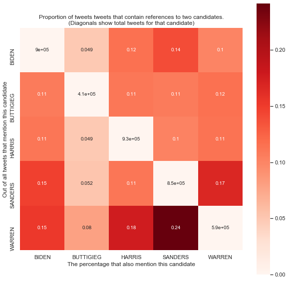
We read this figure as follows: for any off-diagonal cell, we assume that we have a tweet mentioning the candidate on the y-axis for that row. Then, the cell proportion is the probability of that tweet also mentioning the candidate on the x-axis for that column. The diagonal elements give the total number of tweets in the sample for each candidate.
As we can see, most candidate pairs have a co-occurrence probaility of 11-15%, with some notable exceptions. Sanders and Warren have a dramatically higher probability of being co-mentioned in a tweet. Meanwhile, Buttigieg has a much lower probability of being co-mentioned with any other candidate, owing to the fact that his tweet numbers are relatively low. As well, for all tweets about Buttigieg, there is a relatively equal proportion of co-mentions with all other candidates, likely due to people tagging basically all the candidates at once.
One conclusion from this chart is that candidate co-occurrence is a relatively consistent phenomenon for almost all candidates. That is, although the co-mentioning of two or more candidates in a tweet will likely confuse the sentiment classifier, it does not appear to happen in a systematic way for any particular candidate, meaning that such errors are likely to be evenly distributed.
The code to produce the matrix can be found here: Script, Notebook